July 5, 2013 By Christian Murray
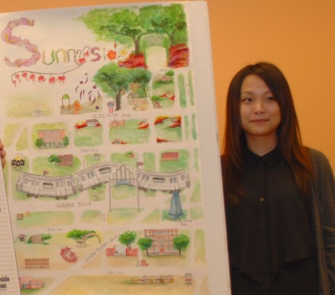
A number of LaGuardia Community College students have been competing in a contest to produce the most artistic–yet practical map–of Sunnyside.
Fourteen students entered the competition and on July 2nd the best map—and its illustrator—were announced.
The winner was Carmen Zhu, a fine/arts design major, who received $1,000.
Zhu’s map focuses heavily on Sunnyside’s greenery, with a strong emphasis on Sunnyside Gardens. The map starts with greenery on the north side of Queens Boulevard and slowly changes to beige as the streets become more commercial on the southern side of boulevard.
Zhu’s map will be used to publicize the neighborhood to visitors and new residents and will contain a Sunnyside business directory and local advertisements.
The map is expected to be finalized and printed later this summer, and will be distributed to hotels in nearby Long Island City and local real estate offices.
The concept and competition was a joint project by the Sunnyside Shines Business Improvement District, the Sunnyside Chamber of Commerce and LaGuardia Community College.
“Sunnyside’s businesses are some of the best in New York City– and I’m very happy to say that the design of this map is an accurate representation of the beauty, energy, and warmth of the neighborhood,” said Swain Weiner, president of the Sunnyside Chamber of Commerce, in a statement.

32 Comments
From the close up image, it seems like Sabba Park is in the wrong spot.
I think the school kid that made the dog poop poster a few weeks ago has more talent and skill.
The green/brown divide on the poster is pretty bad. I’m not surprised some people think that way. I am surprised that people were so happy to go public with their opinions that it won a competition, especially for a poster that’s supposed to advertise the WHOLE neighborhood.
“More commercial” is not what’s being depicted; there are plenty of businesses on the avenues of the north side (Skillman and 43rd Ave. are lined with them). Stereotypically “more ethnic,” “less money,” “less pretty” . . . I think that’s what she was trying to convey, and I don’t think that has any place in this competition. The goal is to express “Sunnyside is great, come visit,” not “the north side is great and the south side sucks” — and that’s what’s coming across. My problem is with that, not with her artistic skills or whatever.
The train is amazing. It’s just not a very practical map.
A full resolution of the map can be seen here: http://sunnysidepost.com/wp-content/uploads/sunnysidemap.jpg
It’s actually pretty nice.
There’s no problem with the artistic style—nobody claimed they were going for realism. The problem, to me, is in the stark difference between how the areas are represented and in how people have interpreted the artwork as “accurate.”
Well, I guess she knew what she was doing when she painted that, knowing that people from the north side would be judging it.
Wow, that’s a real slap in the face to the south side. “An accurate representation of the beauty, energy, and warmth of the neighborhood”? Might as well just say “Yep, we all know the south side is a festering wasteland.”
You’ve got to be kidding me if you think that representation of the Sunnyside Gardens park is accurate. The place looks like a scraggly little dump in real life.
It looks pretty good to me. Don’t know what everyone is bending over backwards for. Plus she’s still a student so cut her some slack. I think the 7 train is kinda cool looking and overall good artistic drawing. If you want something that has everything correct to the dot, get yourself a street map. I am a bit curious what that little structure with the red and white vertical stripes and blue top is that’s between the park and big tree on skillman is though. The picture is a bit blurry so I can’t see the details.
Let’s get one thing straight. No one should knock the girl or Sunnyside Shines for this. The poster is cute and will be modified as time goes on. Well done Carmen Zhu. Children could not make this sort of map and it will probably help tourists and visitors in Sunnyside. At the very least it helps raise the profile of the neighborhood.
That said, we could probably do something less abstract in the future. Am I right?
To be perfectly blunt, that is something I would expect from an elementary school, not a college.
The artist entered a public contest and therefore, her work is open to public scrutiny, for better or worse.
@iamdisappointed: I had wondered about those dog posters…very clever! Okay about bringing new businesses, but how about saving our dingy little movie theater? We need something to justify the outrageous rents we’re paying.
HELLS BELLS MR. MURPHY! I NEVER TOUCH THE DEVIL’S LETTUCE!
Local Hamburglar is smoking those funny cigarettes again. The majority of bloggers are definitely not grandparents and this Sunnyside map depiction is indeed amateur, but congrats to Ms. Zhu for winning!
Ignore the haters Carmen. You did a great job. Don’t let out of touch, closed minded, senile internet tough grandparents bring you down.
To the rest of you fools, you should be ashamed of yourselves.
Ramrod-these comments aren’t cruel-if this poster is expected to be used to advertise businesses and attract interest, then we have set the bar quite low with this “winner”. Additionally, as Superwittysmitty rightly pointed out, this map is factually incorrect in that it doesn’t properly represent the South side of Sunnyside. Face it, this is a very poor depiction of our area and will only suceed in having people mock us. This entry displays zero talent on the part of the “winner” and zero consideration on the part of the local BID.
@86Mets I’ll give more weight to your words when you show some emotional intelligence. I recognize cruelty. You seem not to.
It’s a nice poster- good for her, glad she won. She should do another one, showing the nice parts on the south side. We have a couple trees here too, you know.
@Ramrod
Enough with the drama queen theatrics. People just said they don’t care for this particular piece, that’s all. No need to go into emotional meltdown.
@ Ramrod – need I remind you that this is a blog, so people are entitled to their own opinions. I too believe the art depiction is quite juvenile, but I commend Carmen Zhu for doing her best. Also FYI: many people, primarily law enforcement, prefer pseudonyms when blogging. I have seen firsthand personal attacks on others when real names are used.
Everyone living in sunnyside should be disappointed in this. What hope do we have to attract new businesses/customers/residents/investors if this is supposed to be our official “advertisement” of sunnyside? No thanks, I will pass.
Well, I guess you all can congratulate yourself for your realism. Picking on a young person–especially from the safety of a computer and a pseudonym–should make you feel truly proud of your no non-sense straight talk.
It may be that each of you who has been so cruel gets back ten times over the hard heartedness you have shown here.
Evidently you reject the wisdom of the saying, “If you can’t say something nice, don’t say anything at all.”
You are like little children picking the wings off flies.
@Ramrod
If you’re preparing for a career in art, best get used to criticism. That’s not cruelty, it’s life. Not everybody is going to fawn over your every doodling. That’s what mommies, daddies and grandparents are for.
The commenters here have got to be some of the most badly mannered, cruelest people around. The young woman has done her best. We all deserve congratulations when we do that no matter what.
Don’t like it? Complain to the BID who chose it, not to the artist. It is simply cruel.
I prefer the art in the 5 Pointz video a few stories back.
But it’s all a matter of taste. Good luck to the young lady in any event.
This is an absolute joke. This “map” looks like a bad drawing by a toddler. Not a good look for sunnyside. The dog poop poster crafted by ghe student at ps 150 was more impressive than this. I pray the winner isnt an art major…..
Congratulations, young lady. Many more people admire your work than is reflected here.
Seems like a nice young lady,but really,is that Art ?
And also where is this green belt between queens boulevard and 43 ave she is drawing . It’s the exact same on the south side of queens boulevard and 47 street! And that beige looks more like brown is she making some other subtle statement
The south side gets screwed again!
How nice,
so she went to college to reproduce what my 4 year old nephew can do.This belongs on grandma’s refrigerator . 1000 for that shot? Unbelievable!
Her map is the best I have seen. But I’m not sure how it can be used for tourism though.
The 7 train looks like a roller coaster. Probably feels like one for people leaving the Gaslight at 4:00 AM.
I would be really afraid to ride the 7 train if it actually looked like that.